Indicators
The Indicators module is the core analytical engine of the dashboard. It manages the specific metrics and statistical calculations (e.g., Average household size, Population pyramid) that are rendered as charts for end-users.
Indicators View
The main management screen provides a centralized list of all active metrics within the system.
-
Search and Discovery: A real-time Search bar allows administrators to find indicators by title, name, or associated data source.
-
Filtering and Pagination: Users can filter the view to see specific groups of indicators and adjust the number of items displayed per page.
-
Metric Overview: Each entry in the table displays key metadata:
-
Title: The display name and its underlying system namespace (e.g., Households/PopulationPyramid).
-
Data Source: The specific database connection the indicator draws from (e.g., Households).
-
Tag: Any administrative labels used for further categorization.
-
Page: The specific dashboard page where the indicator is currently assigned.
-
Published Status: A visual "Yes" badge confirms if the metric is live.
-
-
Operational Actions
-
Edit: Allows administrators to modify the indicator's configuration, including title, description, page, etc.
-
Design: Allows administrators to configure the visual representation (chart type, colors, and layout) of the indicator using a visual chart designer tool.
-
Test: A critical debugging tool used to verify that the indicator is pulling data correctly from the source before it is published.
-
Flush: Clears the cached data for a specific indicator, forcing the system to re-calculate the metric from the latest raw data.
-
Add Indicator
The Create New Indicator form allows administrators to initialize the backend logic and frontend identity for a new metric. This process generates the necessary component files required to perform data calculations for the dashboard.
Source and Naming
-
Data Source Selection: Administrators must select the primary database (configured in the Data Sources module) that this indicator will query.
-
Indicator Name: This serves as the system-level component name.
-
Format: Must be in CamelCase or formatted and can include slashes to create a folder structure (e.g., Household/BirthRate).
-
Technical Impact: This name determines the file structure within the application's source code.
-
Development Assistance
-
Sample Code Generation: A toggle switch allows users to choose whether the generated file should include functioning sample code.
- Benefit: Enabling this provides a template that helps developers understand how to implement their own custom indicator logic and query structure.
Localized Identity
-
Reader Friendly Title: The official public-facing name of the indicator as it will appear on charts and reports (e.g., Total Households Enumerated).
-
Description: A multi-language text field used to provide context or define the calculation methodology for users viewing the dashboard.
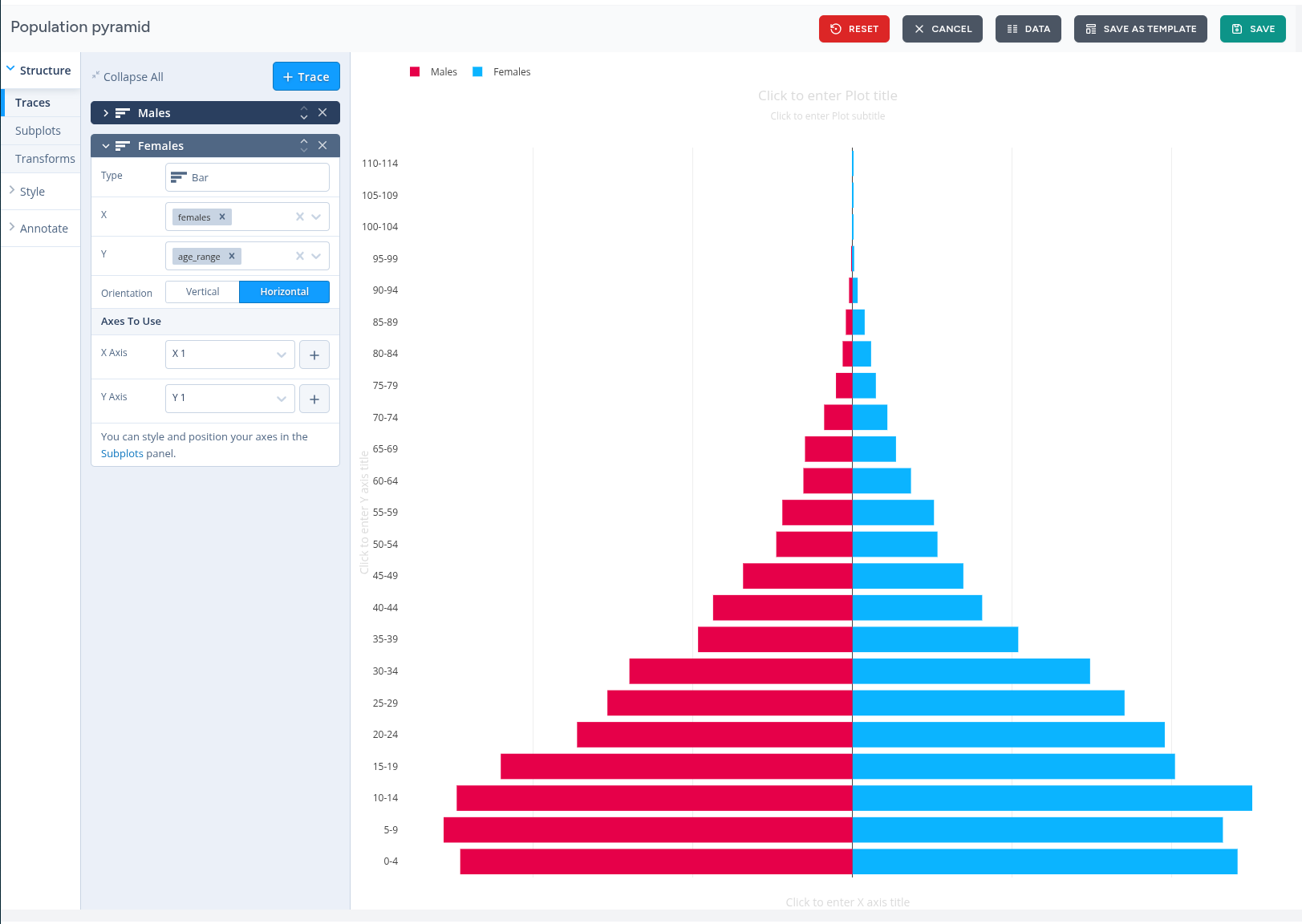
Designing an Indicator
The Design interface is a powerful, interactive workspace where administrators configure the visual and structural properties of an indicator. This module allows you to transform raw query results into professional-grade visualizations, such as population pyramids, bar charts, and line graphs.
Visual Composition and Traces
The left-hand sidebar provides a hierarchical control system for managing the "Traces" (data series) within a chart.
-
Trace Management: Users can add multiple traces to a single chart (e.g., separate traces for Males and Females).
-
Trace Properties: For each trace, you can define:
-
Type: Select the chart format (e.g., Bar, Scatter, Pie).
-
Data Mapping: Assign specific data columns to the X and Y axes.
-
Orientation: Toggle between Vertical and Horizontal layouts.
-
Axes Assignment: Each trace can be mapped to specific X and Y axes, allowing for dual-axis charts or complex subplots.
-
Advanced Styling and Annotation
Beyond basic data mapping, the interface offers deep customization tools:
-
Structure & Subplots: Manage the grid layout of the chart, including margins and spacing between different data series.
-
Transforms: Apply real-time data transformations (e.g., filtering or sorting) directly within the design view.
-
Style: Customize color palettes, fonts, and marker shapes to align with organizational branding.
-
Annotate: Add custom text, labels, or titles directly onto the plot area for better context.
Workspace Controls
The top utility bar provides essential actions for managing the design lifecycle:
-
Live Preview: The central canvas displays a real-time rendering of the chart, allowing for immediate visual feedback as settings are adjusted.
-
Data View: Toggle to the Data tab to inspect the raw numbers currently driving the visualization.
-
Save as Template: Save the current configuration as a reusable template to simplify work when creating related indicators.
-
Save & Reset: Commit your changes to the live dashboard or revert to the previous state if adjustments are unsuccessful.